Made with bytes.
Generating a heatmap from open data using Python
Thu 2 January 2020
Say you have a bunch of geographic open data available and you want to make it easier to interpret or you like long walks on the beach, tasty food and pretty graphics like me.
In this episode we'll use a native language speakers from Mexico dataset. So make sure your shoelaces are well tied and join me in this quest to make some sweet graphics happen.
Also, in case you are pressed for time or reading pseudo-code is more your thing, you can totally skip all this and go head straight to the Github repo, it should contain everything you need to make your own adventure (NO REFUNDS).
OK are they gone? Cool, here we go.
The Crew
* Intro music plays *
Let me introduce you the crew for this quest while the intro music plays:
- Matplotlib as the graph generator
- Seaborn as the matplotlib sidekick to make it look pretty
- Pandas as the data analyst
- Pyshp as the translator that speaks the language of the shape files
- You as the hacker that will make the graphics happen
- No population of native language speakers
- Less than 2,500
- Less than 2,500 and from 2,500 to 4,999
- Less than 2,500 and from 5,000 to 14,999
- From 2,500 to 4,999
- From 2,500 to 4,999 and from 5,000 to 14,999
- From 5,000 to 14,999 and 15,000 and more
- From 5,000 to 14,999
- 15,000 and more
Once you download and unpack the zip file make sure to place it at `data/` at the root of the repository. It should look something like this:
$ tree data/PHLITL_2000
data/PHLITL_2000
├── PHLITL_2000.dbf
├── PHLITL_2000.lyr
├── PHLITL_2000.prj
├── PHLITL_2000.shp
└── PHLITL_2000.shx
From these files the entry point for our code is the shape file `data/PHLITL_2000/PHLITL_2000.shp`. Let's get a sneak peak to look at the file (I'll get my coat).
Introspecting the shape file
For this part of the quest we'll ask pyshp do its thing. Yo buddy it's your turn!
IMPORTANT: Make sure the requirements of the repo are installed and the data has been extracted in the expected location: `data/` (NO REFUNDS).
Running this snippet will produce results similar to:
$ python 01_read_file.py
Columns available: `['AREA', 'PERIMETER', 'DPHLIL_', 'DPHLIL_ID', 'EDO_NUM', 'EDO_LEY', 'MPO_NUM', 'MPO_LEY', 'PHLI_TOT', 'PHLI_TML1', 'PHLI_TML2', 'PHLI_TML3', 'PHLI_TML4', 'ICON_TML1', 'ICON_TML2', 'ICON_TML3', 'ICON_TML4', 'DPHLIL_NUM', 'DPHLIL_LEY']`
Total records: 2480
Municipality: Mexicali
State: Baja California
Total native speakers: De 15,000 y mas
Shape points (sample): `[(788992.7599999954, 3707437.079667801), (788883.5799999968, 3707243.719667798), (788863.5499999961, 3707013.139667798)]`
We are in luck. This is very convenient for our purposes. The `SHP` file contains all the data we need to generate the shapes and it also contains the values to generate the heatmap. YEET! yeet indeed.
Alright crew, time to move to the next step.
Transform and filter the data
It would be totally cool if there was a tool that easily allow us to query and modify the data in the shape file you say.
Fam, say no more. Time for pandas to take the wheel.
IMPORTANT: Make sure the requirements of the repo are installed and the data has been extracted in the expected location: `data/` (NO REFUNDS).
Running this script will generate an output similar to:
# python 02_analize_shape_data.py
Available states: {'Hidalgo', 'Aguascalientes', 'Baja California Sur', 'Nuevo Leon', 'Tamaulipas', 'Nayarit', 'Tlaxcala', 'Baja California', 'San Luis Potosi', 'Mexico', 'Colima', 'Coahuila', 'Queretaro', 'Guanajuato', 'Tabasco', 'Chiapas', 'Morelos', 'Sinaloa', 'Oaxaca', 'Quintana Roo', 'Zacatecas', 'Campeche', 'Puebla', 'Sonora', 'Chihuahua', 'Guerrero', 'Yucatan', 'Michoacan', 'Durango', 'Distrito Federal', 'Veracruz', 'Jalisco'}
Available values: {'Sin poblacion hablante de lengua indigena', 'De 2,500 a 4,999 y de 5,000 a 14,999', 'Menor de 2,500 y de 2,500 a 4,999', 'De 5,000 a 14,999', 'De 15,000 y mas', 'Menor de 2,500', 'De 2,500 a 4,999', 'Menor de 2,500 y de 5,000 a 14,999', 'De 5,000 a 14,999 y de 15,000 y mas'}
This shows the states contained in the dataset and their possible values for each municipality.
Looking at the values extracted it seems that some of them are a superset of the others. Why is that you ask? Your guess is as good as mine.
I know what you are thinking, but where are my graphs? I came here for the graphs. I hear you, we were just about to do exactly that pal.
Filtering and displaying the data per state
As we saw during the data introspection there are 2480 municipalities contained in this dataset. Rendering all of them at once might be a hindrance to process the information which is why we decided to put it into a graphic in the first place.
A good splitting point for this dataset is a state which contains several municipalities. So let's get the crew do that. We'll use the analysed data to generate a values configuration for the colours of the heatmap.
By inspecting the values that the municipalities can have it can be seen that some of those values are a superset of others. e.g. There is a `Less than 2,500` value but there is also a superset `Less than 2,500 and from 2,500 to 4,999`.
So instead of assuming the intensity colour to be used in the heatmap to represent the lower or higher band in the superset a different palette was used to indicate this discrepancy. In the face of ambiguity, refuse the temptation to guess. amirite?
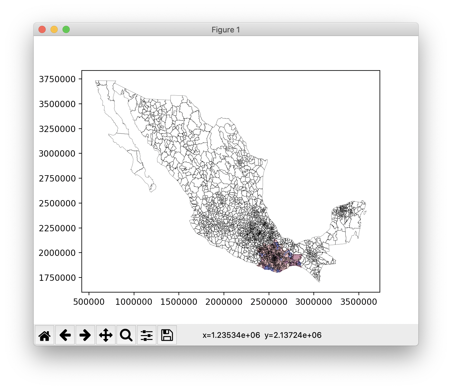
Let's use Oaxaca as the example to generate our first heatmap.
IMPORTANT: Make sure the requirements of the repo are installed and the data has been extracted in the expected location: `data/` (NO REFUNDS).
Running this snippet `python 03_render_municipalities_per_state.py` will generate an output similar to:

Cool, but it's still is not quite there yet.
Rendering all the municipalities adds a bit of noise to the map and doesn't quite show the story we want to tell: The number of native speakers per municipality in Oaxaca state. Let's fix that.
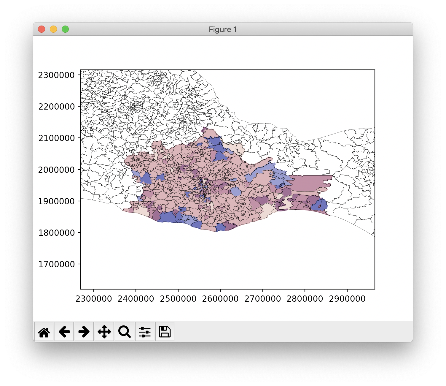
Zoom in. Enhance.
The best way I can think of to focus the viewer attention is to zoom in to the Oaxaca state. As luck would have it there is a gist for that.
IMPORTANT: Make sure the requirements of the repo are installed and the data has been extracted in the expected location: `data/` (NO REFUNDS).
Running this snippet `python 03_render_municipalities_per_state.py` will generate an output similar to:

And there you have it, a zoomed-in graphic showing the Oaxaca state and its municipalities colour coded based on the number of native language speakers.
This is a bit better but there are a few things missing, such as the heatmap legends and its own descriptions. Unfortunately the time for this episode has flown by so we'll need to improve on this code another time.
This is in broad-strokes what is needed to generate a heatmap. A more complete code example is available in the Github repo. Where the author took more creative liberties, hopefully the pseudocode is readable and won't consume too many cognitive units.
In case you are curious to see what the other generated heatmaps look like for the other states the repo has a cache of them in the heatmap directory.
Phew, this is it for now. I hope you had as much fun as I did.
FAQ
Q: Wait what? Is this it?
"Maybe the real treasure was the friends we made along the way"
Footnotes
1. Open data sites in reverse alphabetical order United Kingdom and Mexico